How To Make A LinkedIn Carousel Post: 7 Steps, The Right Dimensions, And 5 Examples That Get Swiped To The Last Slide
Nicolas ColeNovember 13, 2026
How to make a LinkedIn carousel post in 7 steps: the dimensions to use, how to post the PDF, and 5 real examples you can copy slide by slide.
A LinkedIn carousel post is the one format I keep coming back to.
You've seen them in your feed: a post with a stack of slides under it and a page counter that says "1/12." You swipe once, then again, and before you know it you're on the last slide. That swipe is the whole point. Every slide someone moves through is a few more seconds with your ideas, and a few more seconds of LinkedIn noticing that people care.
I've written on LinkedIn for years and crossed 127,000 followers there, and I've tested every format it offers. In my own words: carousels have been the best-performing format on LinkedIn since 2024, and no matter how many other formats we test, we keep coming back to them. (My co-founder Dickie Bush sees it another way these days, and I'll give you his take too.)
Below are the 7 steps I use to go from an idea to a posted carousel, the LinkedIn carousel dimensions that look right in the feed, and 5 real examples broken down slide by slide. If you need the full list of LinkedIn's size limits for every post type, read LinkedIn post size. If your first slide needs a stronger opening line, steal one from these hook examples. And when you're ready to build one without design software, Typeshare for LinkedIn lets you write a carousel card by card and post it as a PDF. You do the writing; the robots do the rest.


What Is A LinkedIn Carousel? (And Do Carousels Still Work?)
A LinkedIn carousel is a PDF pretending to be a slideshow.
On LinkedIn, a carousel is a document post: you upload a PDF (or a PowerPoint or Word file), and LinkedIn shows each page as a slide people swipe through right in the feed. LinkedIn's Upload and share documents page allows PDF, PowerPoint (PPT or PPTX) and Word (DOC or DOCX) files of up to 100 MB and 300 pages. Once it's posted, you can edit the text above it, but you can't change the document itself. And anyone who can see your post can download the file as a PDF.
So when people say "carousel on LinkedIn," they mean a PDF document post with designed pages.
Now, the question everyone asks: do carousels still work?
Here's my view. Carousels perform because they're visual-first, they pull the reader through slide by slide, and most people don't know how to make one. As I put it in The 5 Best Writing Formats In 2026: "the vast majority of people don't know how to create Carousels, and aren't willing to spend a few hours learning how." That's why I call the skill a moat. Few people bother to learn it, so the ones who do stand out.
Dickie's view, from his own weekly update after diving back into LinkedIn: "I am seeing fewer successful carousels & 'personal image' posts than at this time last year," and more successful tweet screenshots with short commentary. He's adjusting his cadence and testing it.
Both things can be true. A format that performs well attracts copycats, and a feed full of lazy carousels makes the good ones work harder. My takeaway: carousels still earn their place, as long as each one is a real piece of writing with a reason to swipe. Test them against your other formats, and keep what your own numbers say works.
A LinkedIn carousel is a PDF in disguise, and the writing inside it decides whether anyone swipes.
Step #1: Pick An Idea With Parts For Your LinkedIn Carousel Posts
Most carousels die on slide 2 because the idea never had a slide 2.
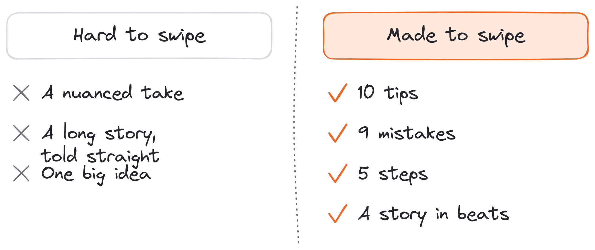
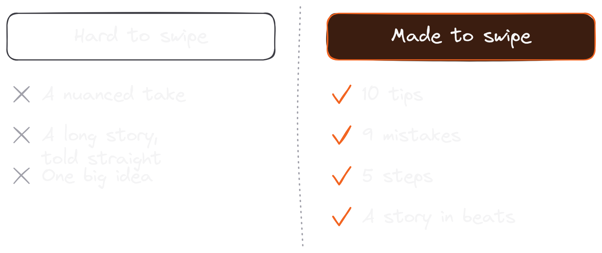
A carousel is a slideshow, and a slideshow needs parts. The ideas that work have a natural "next": a list of tips, a set of steps or a framework with pieces. In my notes on what goes viral, I wrote that the best carousels "are almost always listicles, sharing '10 tips' or '9 mistakes' or '8 reasons' or '7 prompts.'" Nuanced arguments, long stories and topics that need a lot of explanation do worse, because each slide can only hold a few lines.
Choosing the right idea is half the battle.
Here are the shapes that turn into good LinkedIn carousel posts:
- Tips: "19 small tips to upgrade your writing" (one tip per slide)
- Mistakes: "3 mistakes people make self-publishing" (one mistake and its fix per slide)
- Steps: "5 steps to become a LinkedIn ghostwriter" (one step per slide, in order)
- Rules or principles: "5 writing rules from Apple's copywriter" (one rule per slide)
- A story told in beats: before, the turning point, after, the lesson (one beat per slide)
The fastest place to find these ideas is your own best posts. If a text post did well and it already has a list in it, it's a carousel waiting to happen. Look for the posts where people commented "saving this," because people save carousels.
Pick an idea with parts, and the slides almost write themselves.
Step #2: Write It Like An Article (How To Create A Carousel Post On LinkedIn)
Open a blank document first.
The most common way to make a bad carousel is to start by picking colors. Write the words first. In How we create viral LinkedIn carousels, Dickie and I describe carousels as "just blog articles," and that's the best way I know to think about them. A carousel has the same parts as any article, only spread across pages.
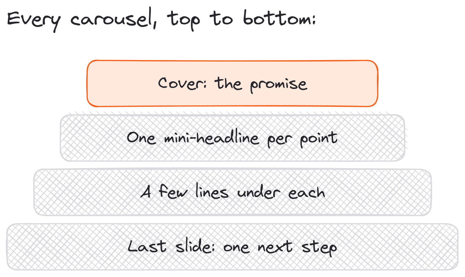
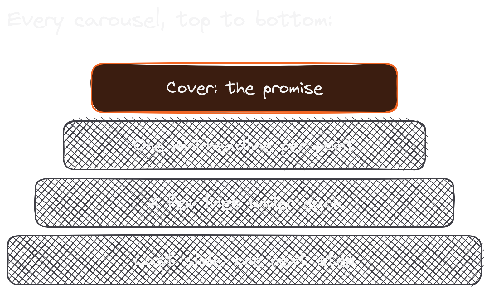
Here's the structure every carousel I make follows:
- The cover slide: a headline that makes a promise ("5 Simple Steps To Become A LinkedIn Ghostwriter") and, if you want, a subheadline that handles the objection ("Even if you've never written anything for anyone before").
- One slide per point: a mini-headline for each step, tip or mistake ("Step 1: Say Exactly What You Do In Your Bio").
- A few lines under each mini-headline: the explanation or an example, compressed to its smallest useful form.
- The last slide: a recap or a single next step, such as following you or reading the link in the post.
Compression is the skill. Each slide holds far fewer words than a text post, so every point has to be cut down to the version someone can read in three seconds. If a slide needs a paragraph, it's two slides.
You don't need a new idea to do this, either. On Day 8 of our Ship 30 for 30 cohort, we remixed an Atomic Essay into a LinkedIn carousel. "The same content in a new format is a new asset." An essay you've already written has a headline, points and a closer: that's a carousel's skeleton.
Write it like an article first, and the design step becomes formatting.
Step #3: Get The LinkedIn Carousel Dimensions Right
Pick one page size and never change it mid-carousel.
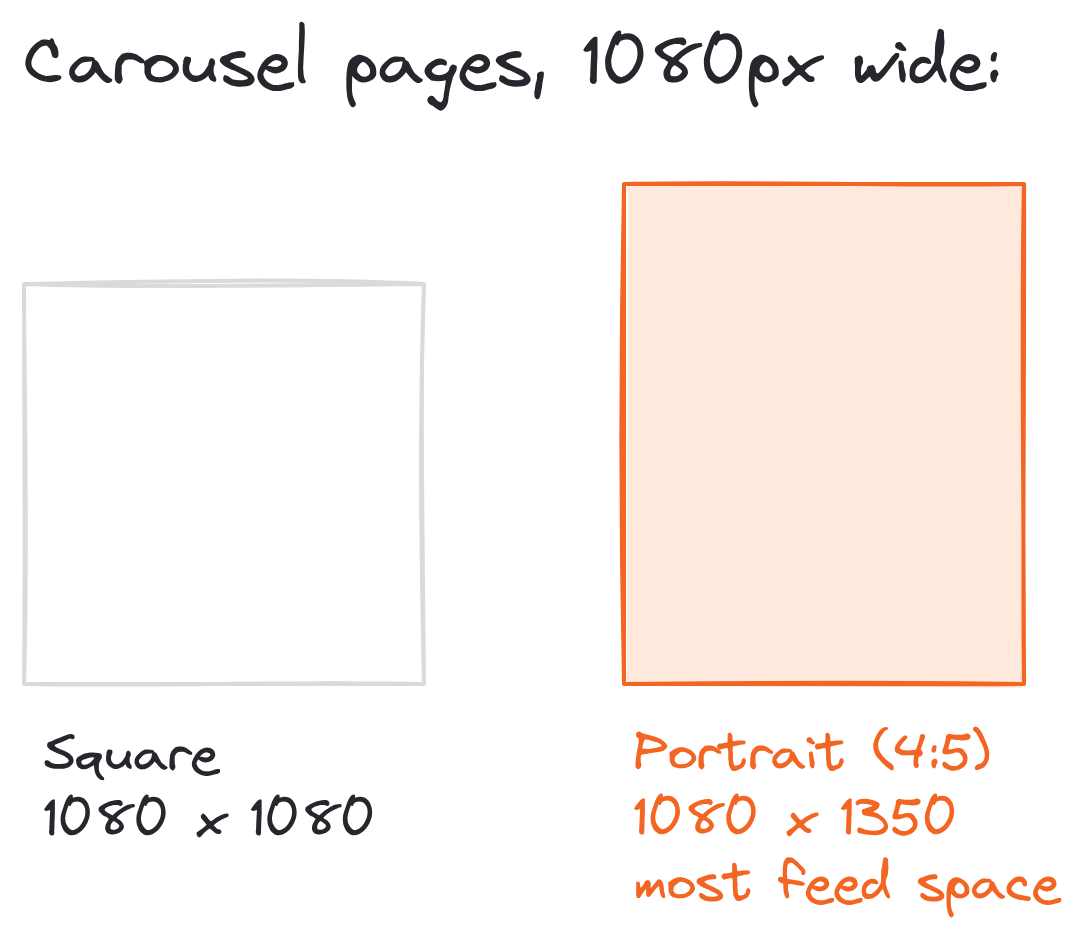
LinkedIn's help center sets limits for documents (100 MB, 300 pages) and no page size, so the shape is up to you. Two shapes look right in the feed:
- Portrait, 1080 x 1350 pixels (4:5): the tallest shape, so it fills the most of a phone screen. The carousels in my examples below are portrait.
- Square, 1080 x 1080 pixels (1:1): easy to make, and it reuses well on other platforms.
Typeshare's Designer agent makes carousels in portrait (4:5) by default, for the same reason. Skip landscape slides: they show up small on a phone, which is where most people will swipe through your carousel.
Then there's length. LinkedIn allows 300 pages, but no one swipes 300 pages. Typeshare's Deck holds up to 20 cards, which is a sensible ceiling. My own range: as few as 4 slides for a short "3 mistakes" carousel, and around 15 to 21 when every slide is one tip from a long list.
A few more rules for the LinkedIn carousel dimensions:
- Keep the same size on every page, so the carousel doesn't jump in size as people swipe.
- Keep the text big and the lines short: most people will read your slides on a phone.
- Read every slide on your phone before you post. If you squint, the font is too small.
For the full list of LinkedIn's image, video and document specs, see LinkedIn post size.
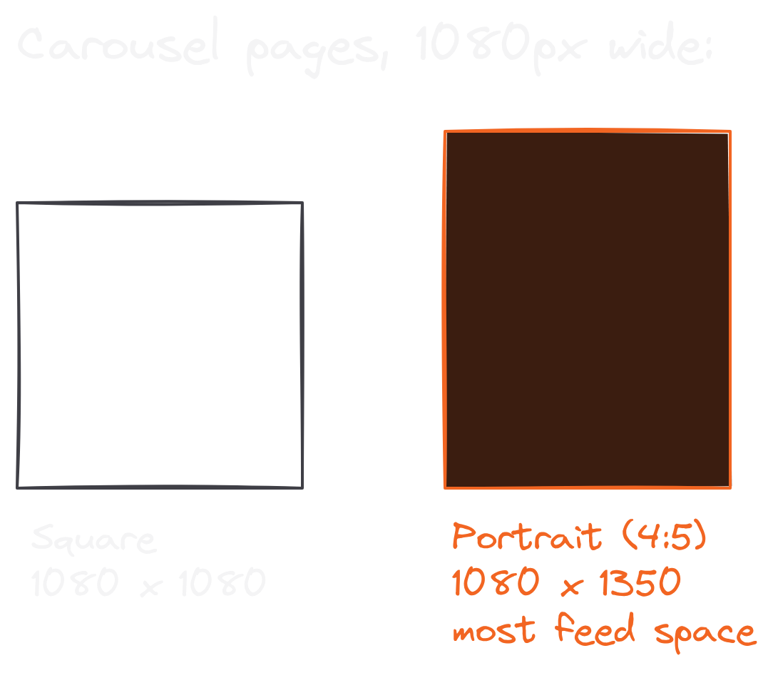
1080 x 1350 for every page is the LinkedIn carousel dimension I'd start with.
Step #4: Design The Slides, Three Ways (How To Make A Carousel On LinkedIn)
You don't have to be a designer to make a carousel.
Carousels involve more skills than writing: you choose the look, the images and the order on each page. AI has made this easier, but your taste still decides whether it looks good. The good news is that you can build the skill in stages. Here are the three I recommend, from my own notes, easiest first.
Stage 1: Text-only carousels in Typeshare. This is where I'd start. In Typeshare, a carousel is a Deck:
- On the Write page, click Deck.
- Write each card, and click Add a page for the next one (up to 20 cards).
- Click the palette icon at the top right to open Theme. Its Layout choice sets each card's look: a tweet-style card, Apple Notes, a quote, a list, a big number or a photo.
- Click Publish, pick LinkedIn, then Publish Now or Schedule.
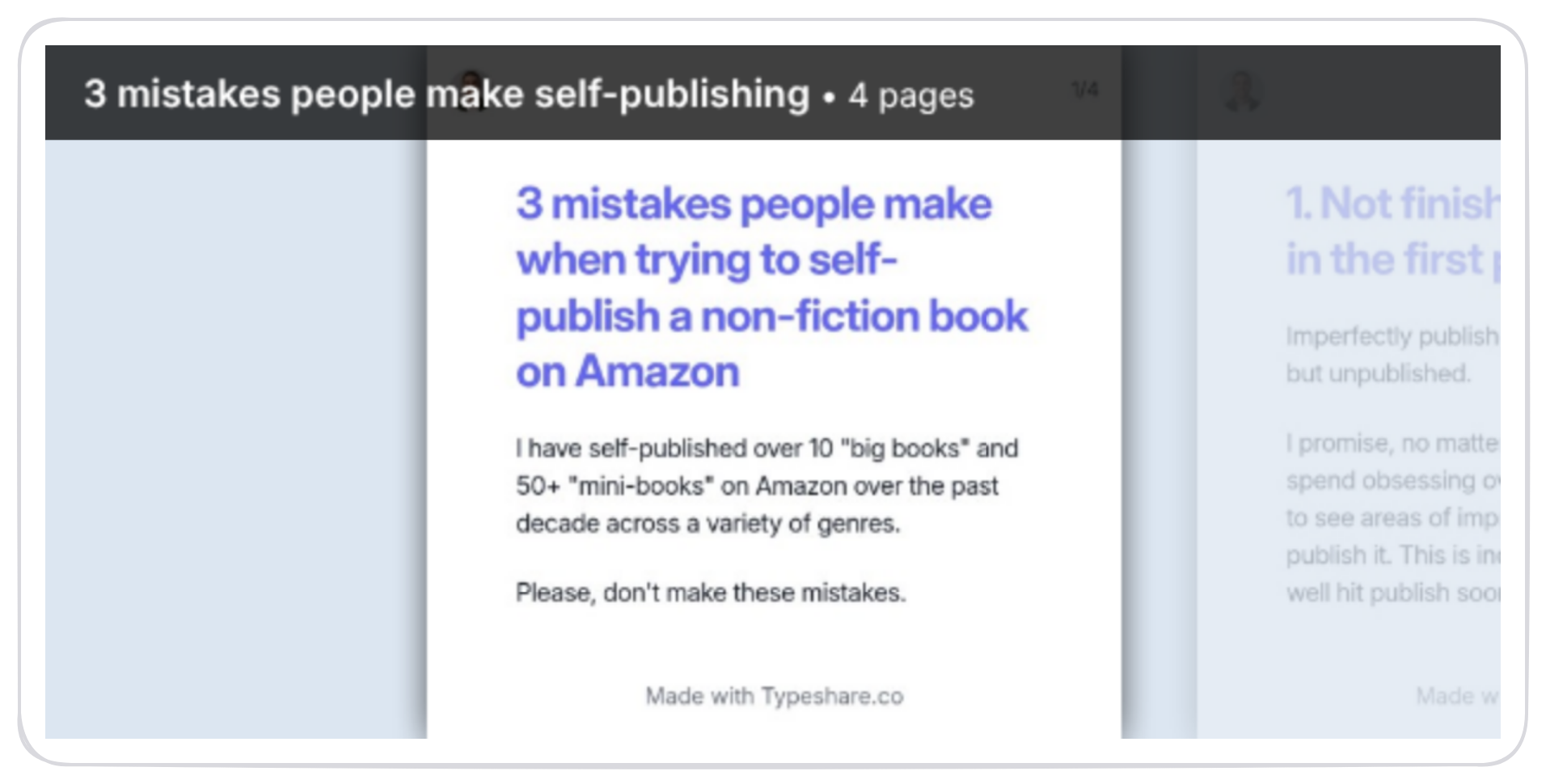
The whole Deck goes to LinkedIn as one swipeable PDF. My "3 mistakes people make self-publishing" carousel above was made this way, which is why it says "Made with Typeshare.co" at the bottom.
Stage 2: Branded carousels in Gamma. When you want more polish, paste your article into Gamma and type "---" between sections to split it into cards. Then pick a theme and add one image per card. Dickie and I wrote up the whole Gamma process, prompts included.
Stage 3: Your own brand kit. The advanced option: design your own brand kit (colors, fonts and layouts) with an AI tool like Claude Design or ChatGPT. Then build every carousel in it. On Typeshare's All-Access plan, the Designer agent does this inside Typeshare: it builds a brand kit with you and turns your essays into carousels in it, using only your own words.
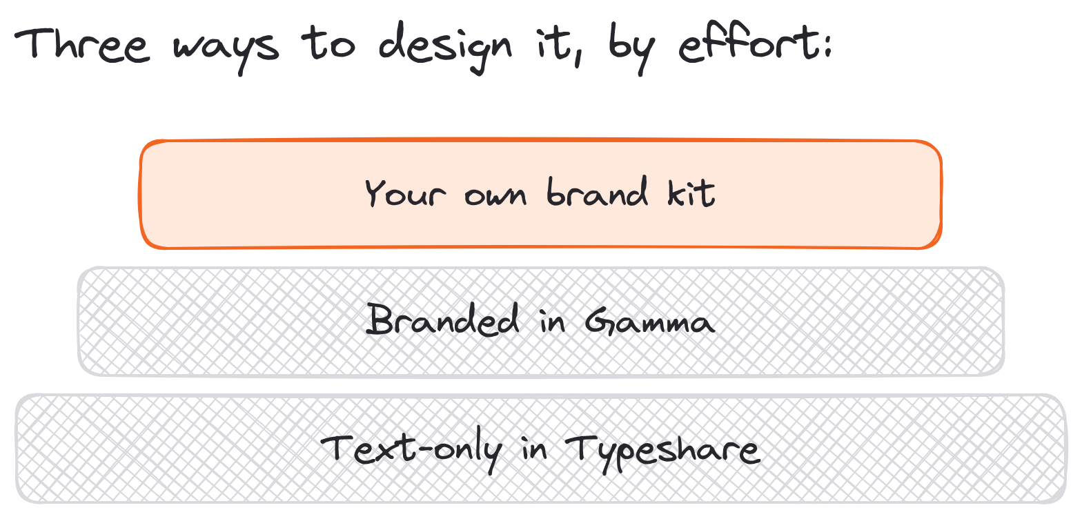
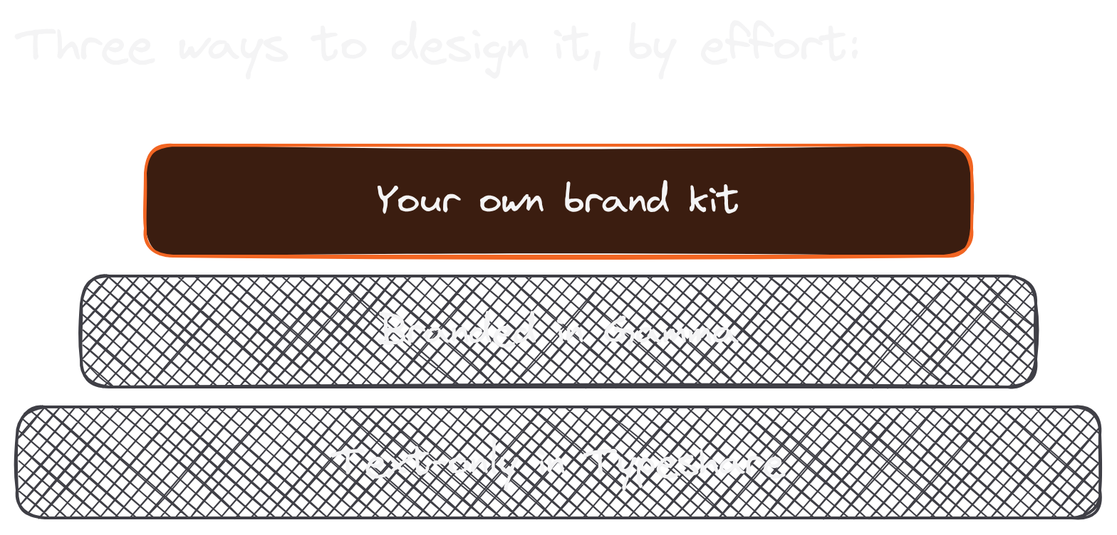
Start with text-only slides, and design more as the carousels earn it.
Step #5: Export A LinkedIn PDF Carousel And Post It
Here's where the slides become a post.
If you built your carousel in Typeshare, you can skip the export: publishing a Deck to LinkedIn sends it as a PDF for you. (To keep a copy, open the ··· menu and choose Export, then PDF document.) Made it somewhere else? Export a PDF and check every page before you post it. Here's how to post a carousel on LinkedIn, straight from LinkedIn's own help page:
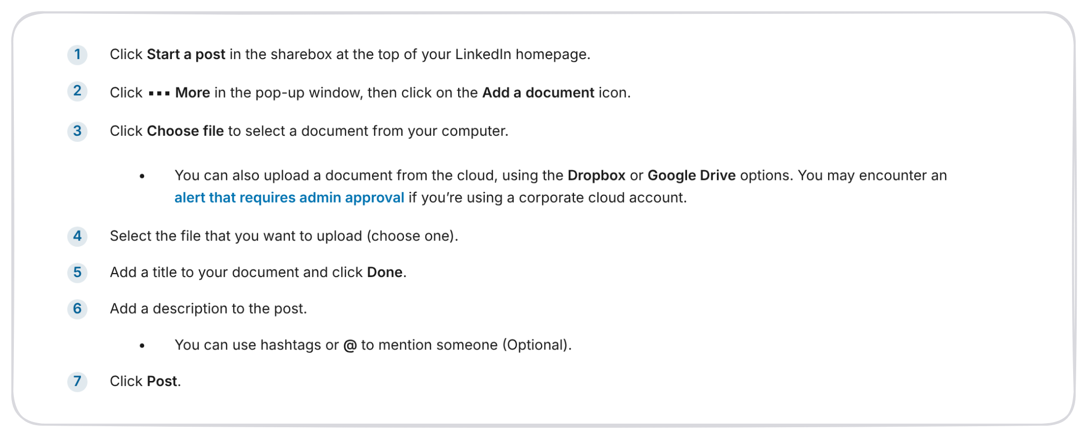
Three of those steps matter more than they look:
- The title (step 5) shows on top of your carousel in the feed, next to the page count. Write it like a headline, because it is one.
- The description (step 6) is your post text. It sits above the carousel and does the work of getting someone to swipe (Step #6 below).
- You can't swap the file later. LinkedIn lets you edit the description, but the document is final once it's posted. So proofread every slide before you click Post.
Two more things to know about a LinkedIn PDF carousel. First, anyone who can see the post can download your PDF, so treat every slide as something people will keep. Second, put your link in the post text: a Typeshare Deck goes out as images and a PDF, so links on its slides can't be clicked.
Export a clean PDF, give it a headline for a title, and post it.
Step #6: Write The Post That Sits On Top Of Your Carousel Post (LinkedIn)
Your carousel has two hooks, and the first one sits above slide 1.
The text above the carousel is the first thing people read. If it doesn't stop them, they'll never see your cover slide. So write the post like any good LinkedIn post: a strong opening line, a reason to care, and then a nudge toward the slides. (For opening lines, read how to write a hook. For the cover slide's headline, read how to write a headline.)
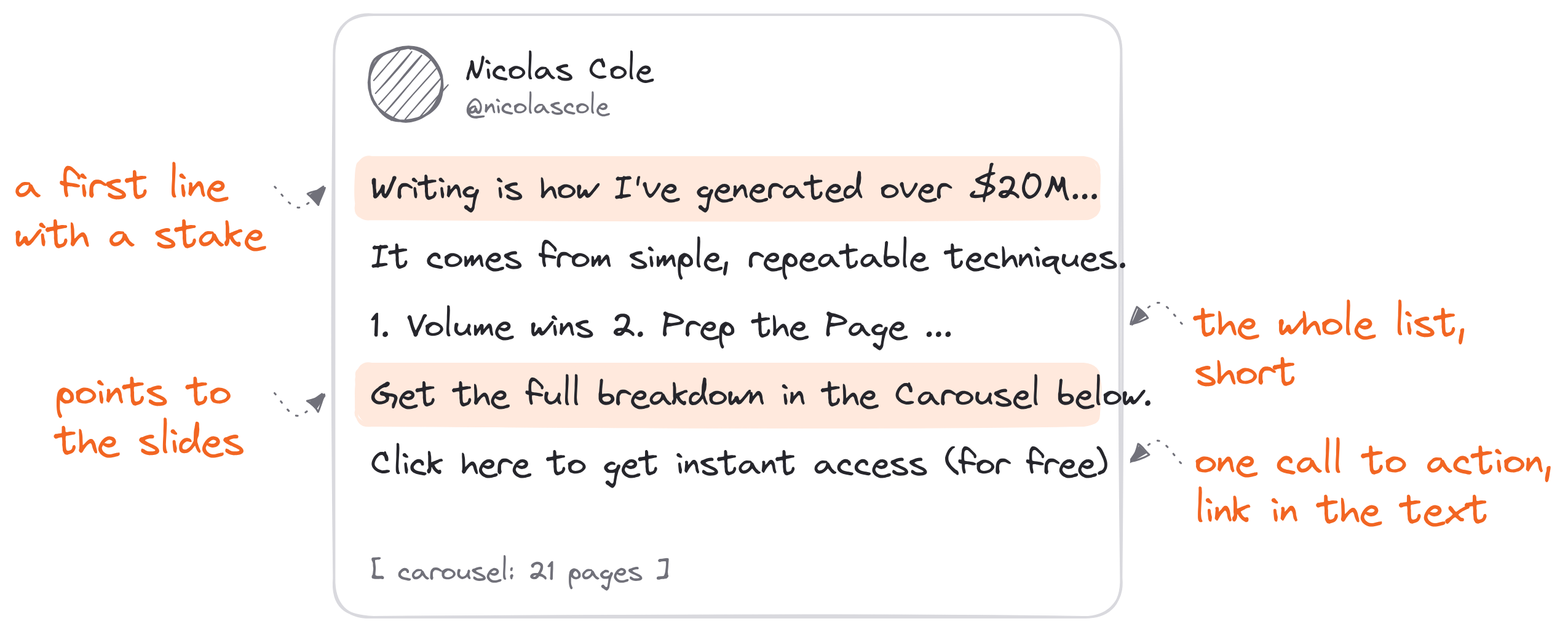
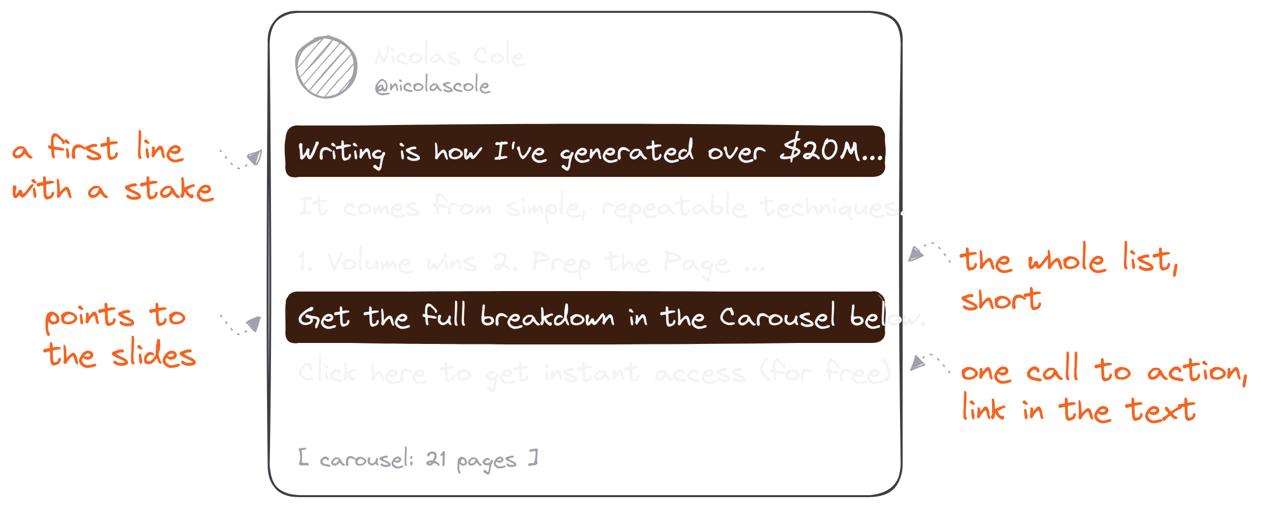
Here's how I wrote the post on top of my 19 Tips To Upgrade Your Writing carousel:
- A first line with a stake: "Writing is how I've generated over $20M in the last 5 years."
- A belief to flip: "Great writing doesn't come from 'natural-born talent.' It comes from simple, repeatable techniques."
- The whole list, short: all 19 tips as one-line bullets, so the post works even for someone who never swipes.
- A pointer to the slides: "Get the full breakdown in the Carousel below."
- One call to action: a free email course, with the link in the text where it can be clicked.
Notice that the post gives the list away. That's on purpose. The bullets tell the reader what's inside, and the slides deliver the depth. Someone who wants "Use the 1/3/1 sequence" explained swipes to that slide.
Keep the call to action to one. A carousel already asks the reader to swipe. So the ask in the text should be simple: follow me, read the link or comment.
The post on top of your carousel decides whether anyone sees slide 1.
Step #7: Schedule It And Reuse It (How To Do A Carousel Post On LinkedIn Every Week)
One carousel is a post; a carousel every week is a library.
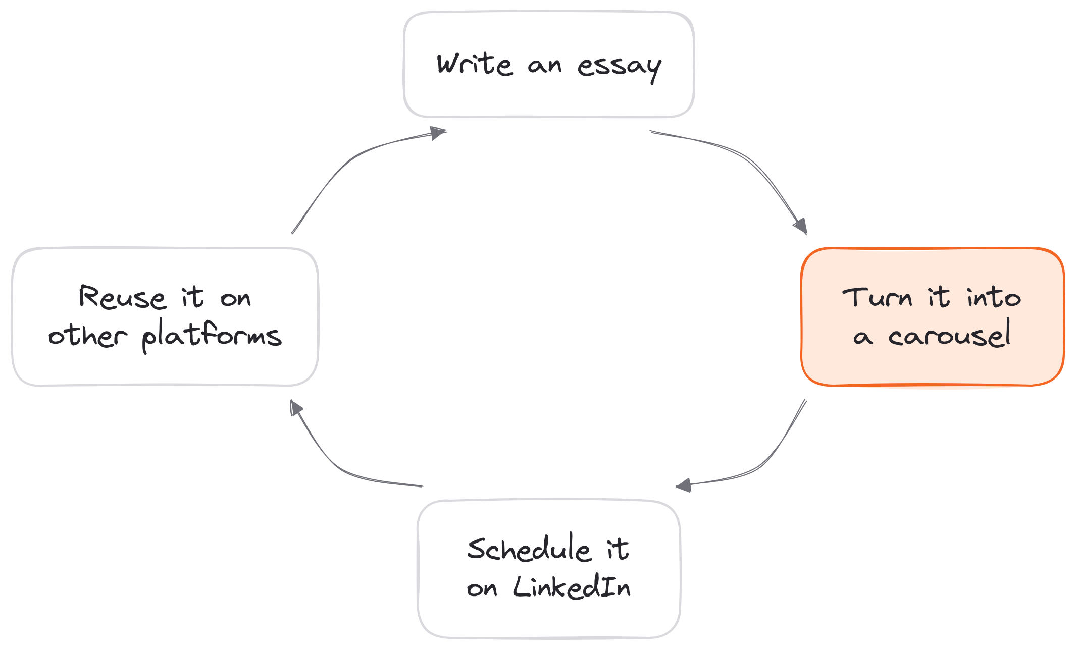
The hard part of carousels is consistency. Building one takes longer than writing a text post, so most people make a few and stop. The fix is to treat each carousel as an asset you'll use more than once:
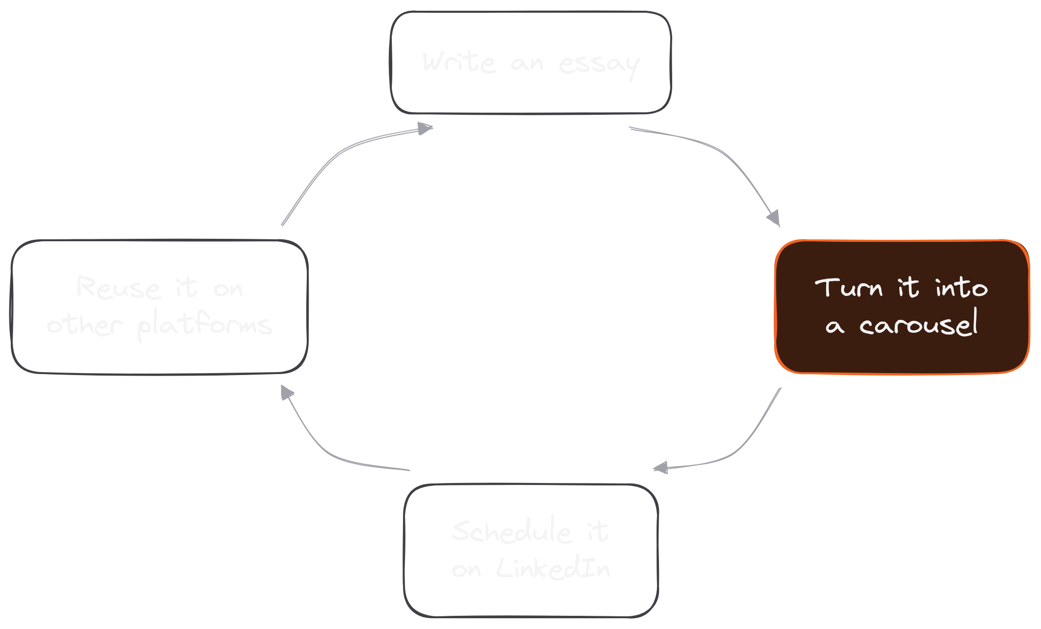
- Schedule it. In Typeshare, a Deck can be scheduled like any post: click Publish, pick LinkedIn, then Schedule. It goes out as a PDF in its slot.
- Post it on other platforms. Decks can also go to X, Threads and Bluesky. As I wrote about carousels, you can reuse them on Instagram and Pinterest too.
- Remix your archive. Every essay, thread or list post you've written is a carousel you haven't made yet. "The same content in a new format is a new asset."
- Let an agent do the assembly. Typeshare's LinkedIn Agent makes carousels by itself from your Digital Brain when an idea has parts, in your brand kit, with a cover card and one idea per card. It posts them as a swipeable PDF with the post text on top, and in Pilot mode each one waits for your review first.
Dickie's caution belongs here, too. If carousels stop performing for you, his own move was to test other formats against them and let the numbers decide. Scheduling ahead makes that easy: you can see a week of formats side by side.
Schedule it, reuse it, and a single carousel becomes a habit.
5 LinkedIn Carousel Post Examples, Slide By Slide
The fastest way to learn the format is to swipe through good ones.
Here are 5 LinkedIn carousel examples, each with the idea shape it uses and why it works. The first four are mine, and you can open each one on LinkedIn. The fifth is an example I wrote for this article to show the "story in beats" shape.
Example #1: 19 Tips To Upgrade Your Writing (a long list)
19 Tips To Upgrade Your Writing (In 5 Minutes) is 21 pages: a cover, one slide for each of the 19 tips, and a closing slide.
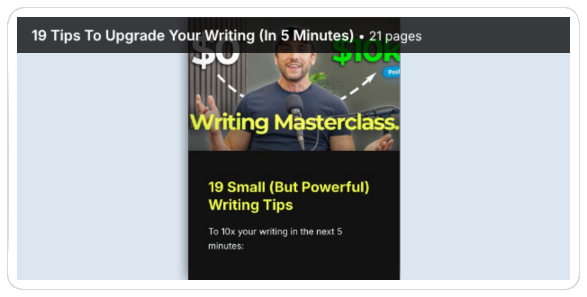
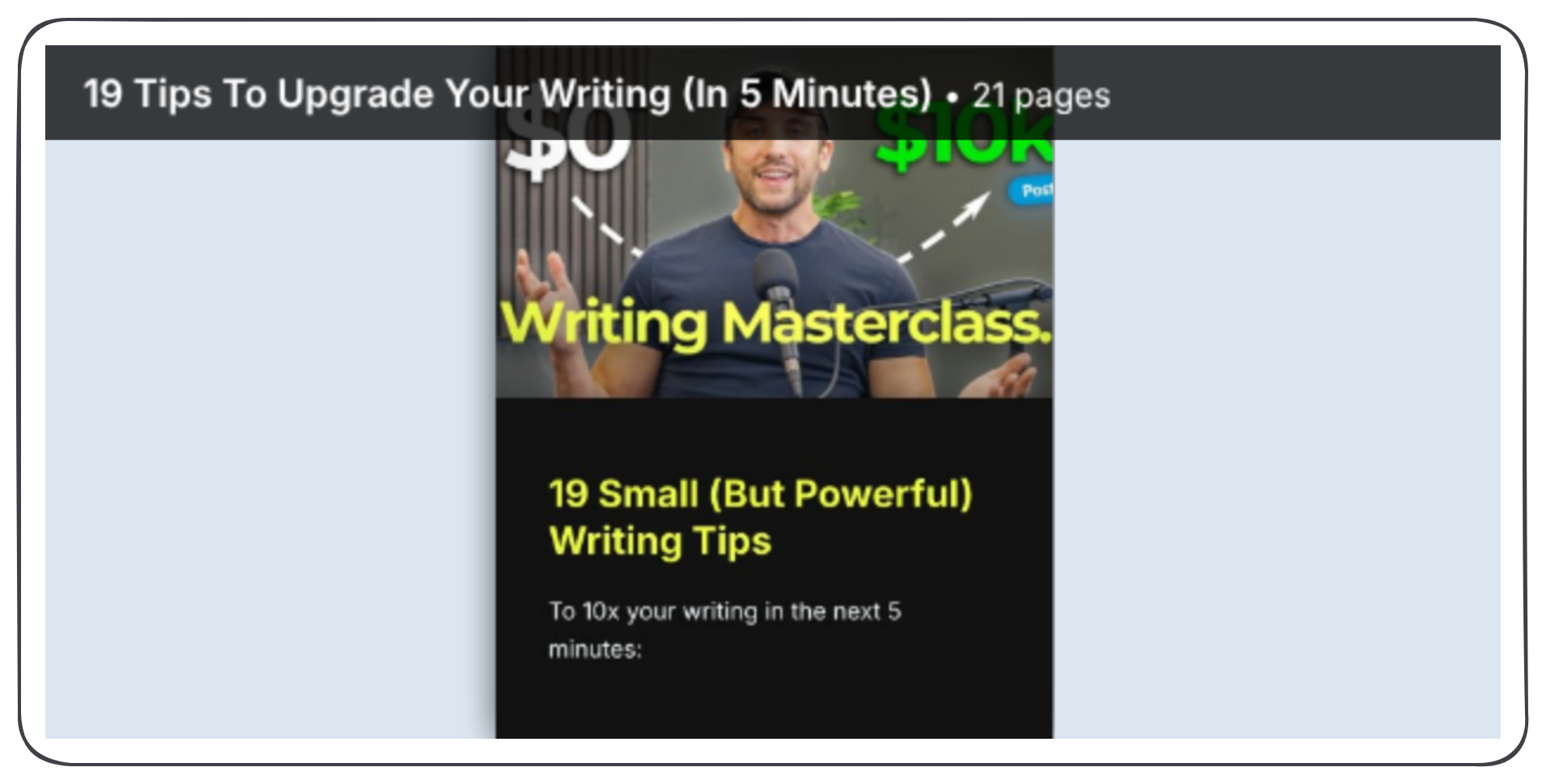
Why it works: the cover makes a big, specific promise ("19 small (but powerful) writing tips… to 10x your writing in the next 5 minutes"), and every slide pays off one line of the list in the post. Long lists are the easiest carousels to write, because the outline is already done.
Example #2: The Secret Weapon That Saved Apple From Bankruptcy (a story, then rules)
This one is 15 pages. The post tells a short story: in 1997 Apple was 90 days from bankruptcy, until Ken Segall, the creative director behind "Think Different," helped save it. The carousel delivers the payoff: 5 writing rules, starting with "Simplicity is velocity."
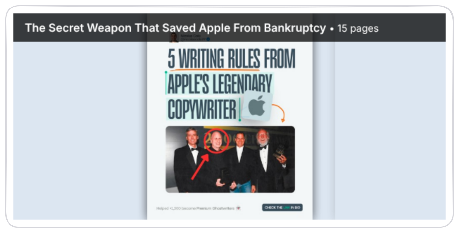
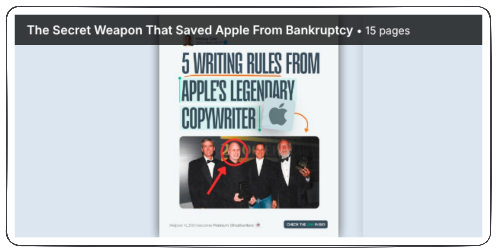
Why it works: the story earns the swipe, and the list makes it worth saving. Notice the cover uses a photo with a red circle and an arrow, a simple trick that makes people look closer.
Example #3: 3 Mistakes People Make Self-Publishing (a short remix)
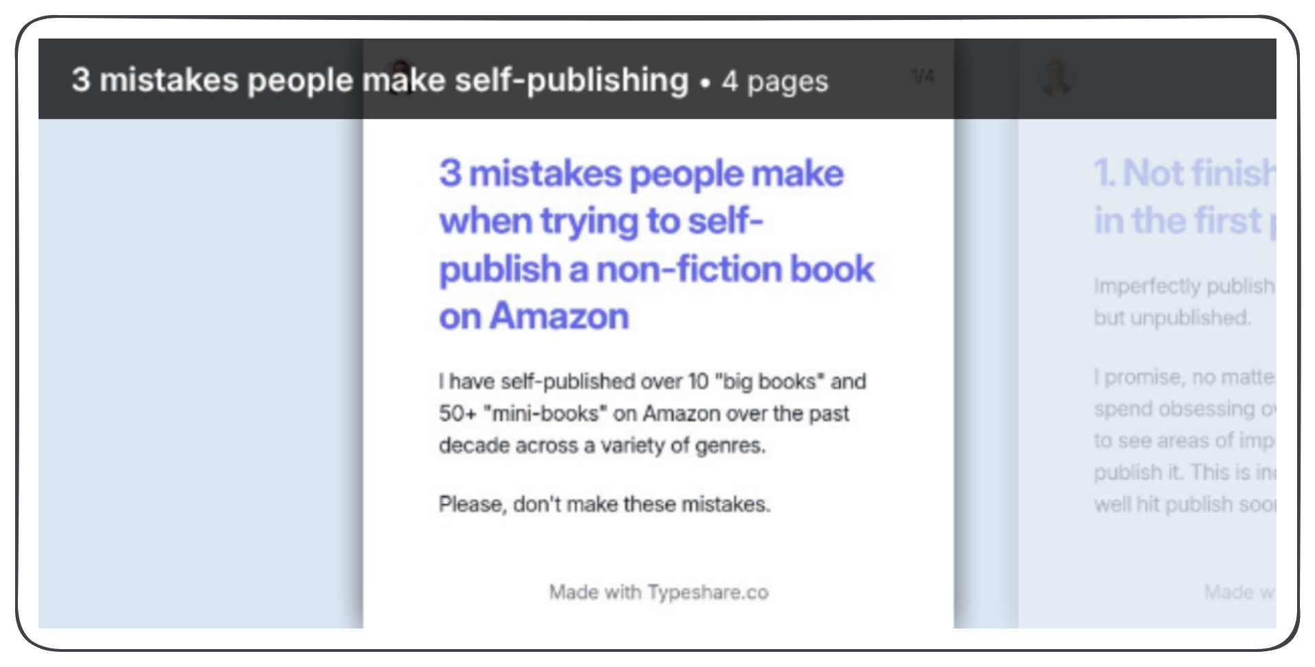
My shortest carousel here is 4 pages: a cover with the promise and my credibility ("I have self-published over 10 'big books' and 50+ 'mini-books' on Amazon"), then one slide per mistake. It started as an Atomic Essay, and I rebuilt it as a text-only Deck in Typeshare.
Why it works: it shows how little a carousel needs. Four clean, readable pages and a clear promise do the job. (It's the carousel pictured at the top of this guide.)
Example #4: 5 Simple Steps To Become A LinkedIn Ghostwriter (steps)
This is the carousel Dickie and I walk through in How we create viral LinkedIn carousels, built in Gamma. Its cover headline is "5 Simple Steps To Become A LinkedIn Ghostwriter." The subheadline handles the objection: "Even if you've never written anything for anyone before, suck at sales, and don't have an audience." Each step gets its own slide, starting with "Step 1: Say Exactly What You Do In Your Bio," and an example under it.
Why it works: steps carry their own momentum. A reader on step 2 wants step 3.
Example #5: From Burnout To A 4-Day Week (a story in beats, written for this article)
This one is a made-up example I wrote to show the shape:
- Slide 1 (cover): "I worked 70-hour weeks for 3 years. Here's how I got down to 4 days."
- Slide 2 (before): what a normal week looked like.
- Slide 3 (the turning point): the one week that forced the change.
- Slides 4 to 7 (the changes): one change per slide, each with a small example.
- Slide 8 (the lesson): one line the reader can apply this week.
- Slide 9 (closing): "Follow for more on building a business you don't need a vacation from."
Why it works: a story can be a carousel when you cut it into beats and give each beat a slide. The middle slides are still a list, which keeps people swiping.


Five shapes, one rule: every LinkedIn carousel post example here gives the reader a reason to swipe to the next slide.
FAQ
What is a LinkedIn carousel?
A LinkedIn carousel is a post with a document attached (most often a PDF). LinkedIn shows its pages as slides people swipe through in the feed. LinkedIn calls it a document post; "carousel" is what everyone else calls it.
How do you post a carousel on LinkedIn?
Click Start a post, then More and Add a document. Choose your PDF and give it a title, then write the post text and click Post. In Typeshare, you can write the carousel as a Deck and publish or schedule it to LinkedIn, and it goes out as a PDF for you.
What size should a LinkedIn carousel be?
LinkedIn doesn't set a page size for documents, only the limits: 100 MB and 300 pages. Portrait pages at 1080 x 1350 pixels (4:5) fill the most of the feed; square pages at 1080 x 1080 are the other safe choice. Use the same size on every page.
How many slides should a LinkedIn carousel have?
Enough for one idea and no more. My own carousels run from 4 slides to 21. A Typeshare Deck holds up to 20 cards.
Can I edit a LinkedIn carousel after posting it?
You can edit the post's text, but not the document. To fix a slide, you have to delete the post and upload a new PDF, so proofread first.
Can you put links in a LinkedIn carousel?
Put the link in the post text, where it's clickable. A Typeshare Deck goes out as images and a PDF, so links inside the slides can't be clicked.
Do LinkedIn carousels still work in 2026?
I think so: they've been the best-performing format I've tested on LinkedIn since 2024. Dickie has seen fewer successful carousels than a year earlier and is testing tweet screenshots with short commentary. Test both, and go with your own numbers.
Can I make a LinkedIn carousel without Canva?
Yes. You can write one card by card in Typeshare (click Deck on the Write page), or paste an article into Gamma. Neither needs any design skills to start.